
The Amanda Edit: The Warmth of Brown
Currently loving: all things brown.
This month, we're embracing the warmth of brown in all its forms. From rich chocolate and walnut to softer shades of camel and taupe, we're drawn to the depth, softness, and natural beauty these tones bring to a home.
We're finding inspiration everywhere, from suede and leather in fashion to warm bronze finishes, textured wallcoverings, and soft, rounded silhouettes.
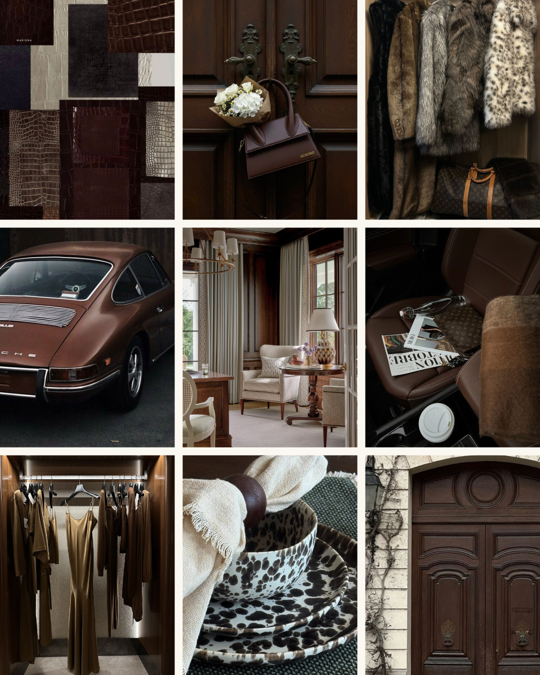
And while brown is having a moment, it's a color we've always loved incorporating into our projects. Here's a closer look at how we're bringing that warmth into the homes we design.
Choosing Bronze Over Black
One of the ways we're bringing this warmth into our projects is through architectural details, particularly metal windows and doors.
While black window frames create a beautiful, dramatic contrast, we're increasingly drawn to warmer bronze finishes. Bronze has a softer presence, allowing the windows to complement the surrounding materials rather than stand out against them.
Paired with natural stone, warm wood tones, and creamy neutrals, bronze feels a little more organic and connected to the architecture. It's a subtle shift, but one that can completely change the feeling of a room.
We love that these warmer metal finishes still provide definition and depth without creating such a stark contrast. The result feels refined, timeless, and more natural.
A More Tonal Approach to Color
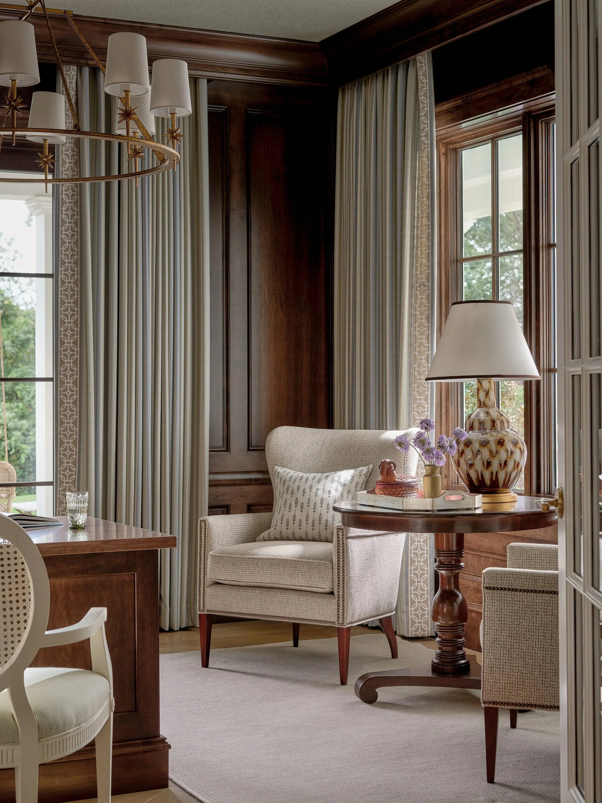
Brown doesn't have to mean a dark room. In fact, some of our favorite ways to use it involve layering several shades within the same color family.
Chocolate brown alongside warm ivory, caramel, mushroom, and soft taupe creates depth without relying on bold contrast. Rather than having every element stand apart, the colors work together to create a softer, more cohesive feeling.
This is something we're thinking about throughout all our projects, from cabinetry and architectural finishes to upholstery, drapery, and smaller decorative details.
One of our favorite design tips? When working with a tonal palette, vary the textures as much as the colors. A smooth leather chair, linen sofa, polished wood table, and woven wallcovering can all sit within a similar palette while bringing completely different dimensions to a space.
Texture Makes All the Difference
If there's one thing that makes brown feel especially beautiful, it's texture.
We're loving the return of suede, not only in fashion but in interiors as well. There's a softness and richness to suede that feels luxurious without being overly formal. The same can be said for velvet, woven grasscloth, and beautifully grained wood.
These materials bring warmth in a way that color alone cannot. A chocolate suede accent chair, a textured wallcovering, or a richly stained walnut cabinet can make a space feel more inviting without adding another color to the palette.
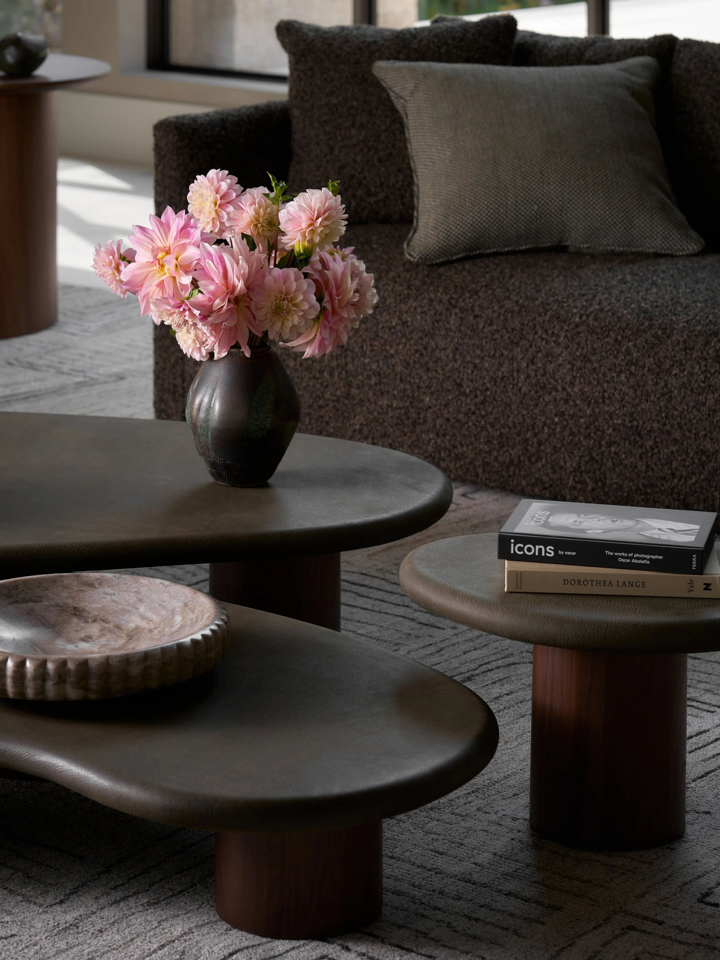
We're also drawn to softer silhouettes and rounded edges. Curved upholstery, sculptural tables, and organic shapes balance the richness of darker materials and keep a room from feeling too structured or harsh.
It's this combination of softness, texture, and natural materials that makes a brown palette feel so livable.
Bringing Shades of Brown Into Your Home
You don't have to redesign an entire room to embrace a warmer palette. Sometimes the smallest additions can make the biggest difference.
A beautiful chocolate brown throw draped over a neutral sofa, a pair of suede pillows, a sculptural walnut bowl, or a textured wallcovering in a powder room can introduce warmth without overwhelming the space.
For a more permanent approach, consider bronze hardware, warm wood cabinetry, or deeper chocolate upholstery. These are details that work beautifully alongside existing neutrals and can make a home feel more layered over time.
The Finishing Touches
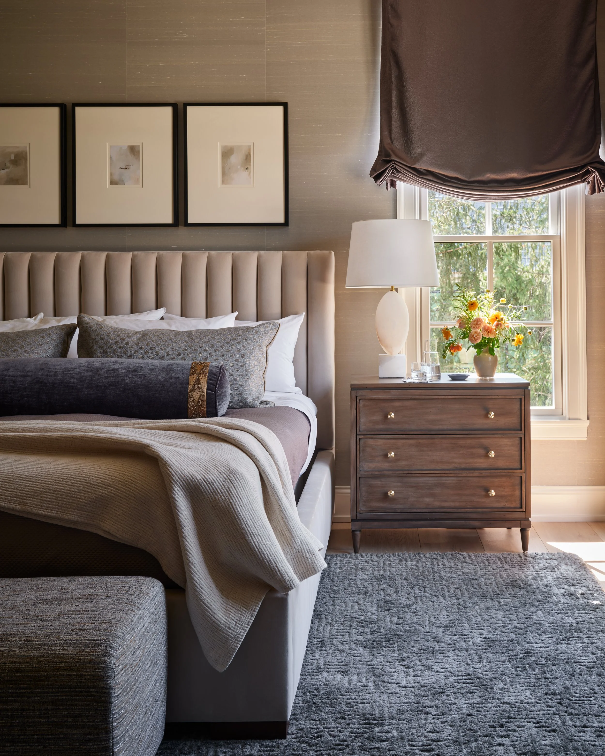
We're always thinking about how the smaller details contribute to the overall feeling of a home. Shades of chocolate are particularly beautiful in natural materials and accessories that add warmth and character without feeling overly styled.
A few pieces we're especially drawn to:
Chocolate brown suede or velvet accent pillows
Sculptural walnut bowls and decorative trays
Soft cashmere or wool throws in warm brown tones
Aged bronze accessories and decorative objects
Leather-wrapped boxes and small tabletop accents
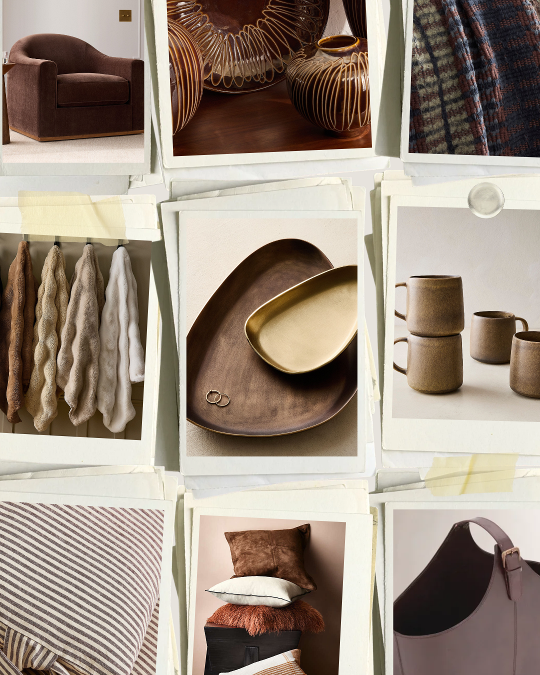
These details make a room feel more personal and collected over time. Whether it's a single accent or a more layered approach, this color palette brings a sense of warmth that works beautifully across so many different styles of interiors.
And while we're especially inspired by it this October, it's a color we'll continue coming back to for years to come.
Take a closer look at what's inspiring us this October. 🤎